
Choosing your print
How to choose typography prints for your home
Choose typography wall art that suits your room: wording, colour, readable sizes and simple ways to arrange one print or a small group.
By Ministry of Posters · Updated
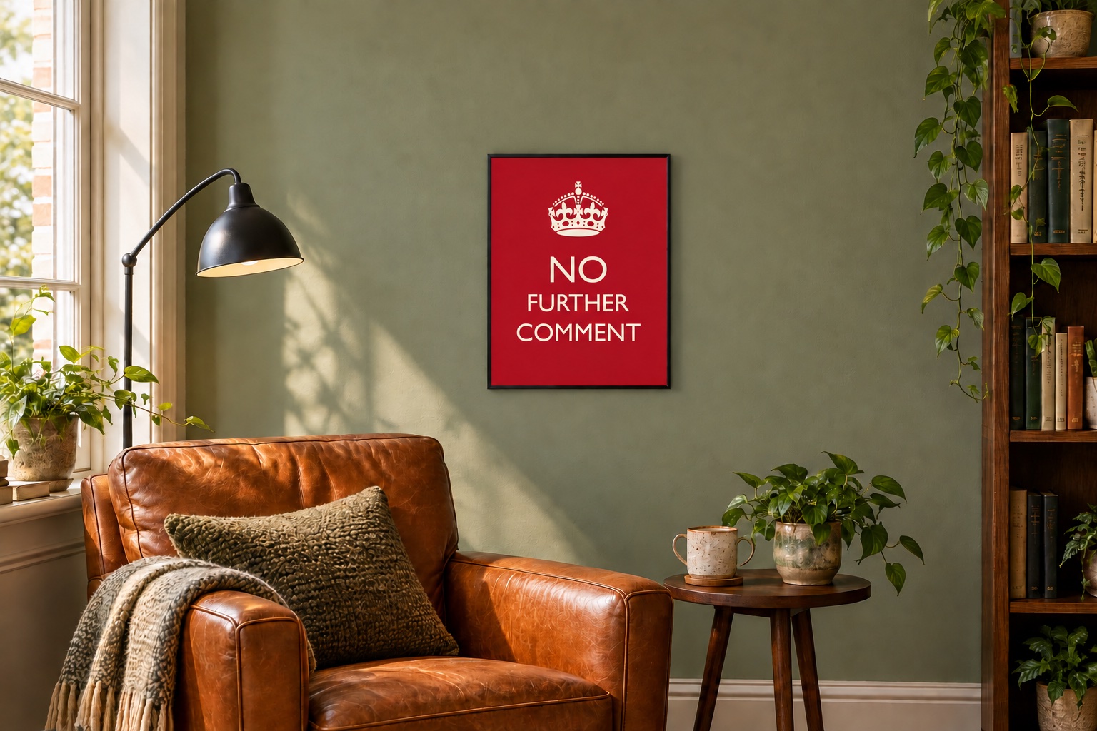
A typography print has two jobs: it needs to look right in the room, and you need to want to live with what it says. Start with the words. A beautifully arranged statement that annoys you by Tuesday has failed its assignment.
Choose words you want to live with
Think about the room and the people who use it. A dry workplace joke can suit a study; a food-related notice can feel at home in a kitchen. For a shared living room, choose wording that makes sense to everyone rather than a private joke that needs explaining.
If you prefer a sign or an unofficial instruction, browse Public Instruction. For office humour, try Managed Expectations. The department names are part of the joke; the designs themselves should make choosing straightforward.
Work with the colours already in the room
Look at the wall, furniture and nearby artwork together. Picking up one existing colour can connect a print to the room without matching everything. A stronger contrast can make the print a focal point, especially on a plain wall.
Check the full product image, including the background and border. Small differences in screen settings and lighting mean an image is a guide to colour rather than a paint-matching sample.
Make the lettering readable
Imagine viewing the print from its actual position: above a sofa, beside a door or across a desk. A long message needs more reading time than a short headline. Use the poster size guide to mark out the size before deciding.
Keep enough clear space around the artwork to see it properly. Above furniture, test the arrangement at a comfortable height while seated as well as standing. There is no need to follow a fixed hanging rule if it makes the print awkward to view.
One statement or a small group?
One print is a useful starting point when the room already has patterned textiles or several decorative objects. For a pair, look for a shared colour or a similar visual weight. The messages do not need to be identical to belong together.
For a group, arrange paper outlines on the wall first. Repeat a frame colour or a spacing pattern to give the arrangement some order. Leave room to enjoy each design rather than fitting in every favourite at once.
Check the format before buying
Choose an unframed poster if you want control over the frame. Choose a framed print when you prefer to order the artwork and frame together. Read the product's materials and finish panel, and confirm the selected size: the same design can have several formats in the shop.
For room-specific ideas, see our kitchen print guide or home office guide.
Working with a compact sitting room or an entrance? See our guides to small living room wall art and hallway prints for more specific arrangements.